Components
Components represent the basic building block in Preact. They are fundamental in making it easy to build complex UIs from little building blocks. They're also responsible for attaching state to our rendered output.
There are two kinds of components in Preact, which we'll talk about in this guide.
Functional Components
Functional components are plain functions that receive props as the first argument. The function name must start with an uppercase letter in order for them to work in JSX.
function MyComponent(props) {
	return <div>My name is {props.name}.</div>;
}

// Usage
const App = <MyComponent name="John Doe" />;

// Renders: <div>My name is John Doe.</div>
render(App, document.body);Note in earlier versions they were known as
"Stateless Components". This doesn't hold true anymore with the hooks-addon.
Class Components
Class components can have state and lifecycle methods. The latter are special methods, that will be called when a component is attached to the DOM or destroyed for example.
Here we have a simple class component called <Clock> that displays the current time:
class Clock extends Component {
	constructor() {
		super();
		this.state = { time: Date.now() };
	}

	// Lifecycle: Called whenever our component is created
	componentDidMount() {
		// update time every second
		this.timer = setInterval(() => {
			this.setState({ time: Date.now() });
		}, 1000);
	}

	// Lifecycle: Called just before our component will be destroyed
	componentWillUnmount() {
		// stop when not renderable
		clearInterval(this.timer);
	}

	render() {
		let time = new Date(this.state.time).toLocaleTimeString();
		return <span>{time}</span>;
	}
}
Lifecycle Methods
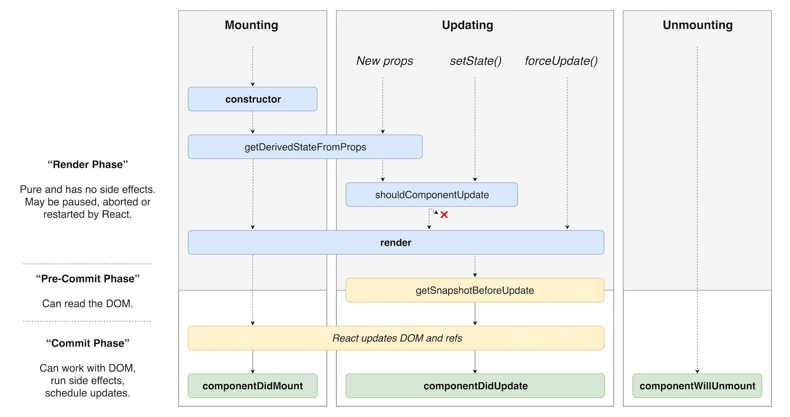
In order to have the clock's time update every second, we need to know when <Clock> gets mounted to the DOM. If you've used HTML5 Custom Elements, this is similar to the attachedCallback and detachedCallback lifecycle methods. Preact invokes the following lifecycle methods if they are defined for a Component:
| Lifecycle method | When it gets called |
|---|---|
componentWillMount() |
(deprecated) before the component gets mounted to the DOM |
componentDidMount() |
after the component gets mounted to the DOM |
componentWillUnmount() |
prior to removal from the DOM |
componentWillReceiveProps(nextProps, nextContext) |
before new props get accepted (deprecated) |
getDerivedStateFromProps(nextProps, prevState) |
just before shouldComponentUpdate. Return object to update state or null to skip update. Use with care. |
shouldComponentUpdate(nextProps, nextState, nextContext) |
before render(). Return false to skip render |
componentWillUpdate(nextProps, nextState, nextContext) |
before render() (deprecated) |
getSnapshotBeforeUpdate(prevProps, prevState) |
called just after render(), but before changes are flushed to the DOM. Return value is passed to componentDidUpdate. |
componentDidUpdate(prevProps, prevState, snapshot) |
after render() |
Here's a visual overview of how they relate to each other (originally posted in a tweet by Dan Abramov):

Error Boundaries
An error boundary is a component that implements either componentDidCatch() or the static method getDerivedStateFromError() (or both). These are special methods that allow you to catch any errors that happen during rendering and are typically used to provide nicer error messages or other fallback content and save information for logging purposes. It's important to note that error boundaries cannot catch all errors and those thrown in event handlers or asynchronous code (like a fetch() call) need to be handled separately.
When an error is caught, we can use these methods to react to any errors and display a nice error message or any other fallback content.
class ErrorBoundary extends Component {
	constructor() {
		super();
		this.state = { errored: false };
	}

	static getDerivedStateFromError(error) {
		return { errored: true };
	}

	componentDidCatch(error, errorInfo) {
		errorReportingService(error, errorInfo);
	}

	render(props, state) {
		if (state.errored) {
			return <p>Something went badly wrong</p>;
		}
		return props.children;
	}
}
Fragments
A Fragment allows you to return multiple elements at once. They solve the limitation of JSX where every "block" must have a single root element. You'll often encounter them in combination with lists, tables or with CSS flexbox where any intermediate element would otherwise affect styling.
import { Fragment, render } from 'preact';

function TodoItems() {
	return (
		<Fragment>
			<li>A</li>
			<li>B</li>
			<li>C</li>
		</Fragment>
	);
}

const App = (
	<ul>
		<TodoItems />
		<li>D</li>
	</ul>
);

render(App, container);
// Renders:
// <ul>
//   <li>A</li>
//   <li>B</li>
//   <li>C</li>
//   <li>D</li>
// </ul>Note that most modern transpilers allow you to use a shorter syntax for Fragments. The shorter one is a lot more common and is the one you'll typically encounter.
// This:
const Foo = <Fragment>foo</Fragment>;
// ...is the same as this:
const Bar = <>foo</>;
You can also return arrays from your components:
function Columns() {
	return [<td>Hello</td>, <td>World</td>];
}
Don't forget to add keys to Fragments if you create them in a loop:
function Glossary(props) {
	return (
		<dl>
			{props.items.map(item => (
				// Without a key, Preact has to guess which elements have
				// changed when re-rendering.
				<Fragment key={item.id}>
					<dt>{item.term}</dt>
					<dd>{item.description}</dd>
				</Fragment>
			))}
		</dl>
	);
}